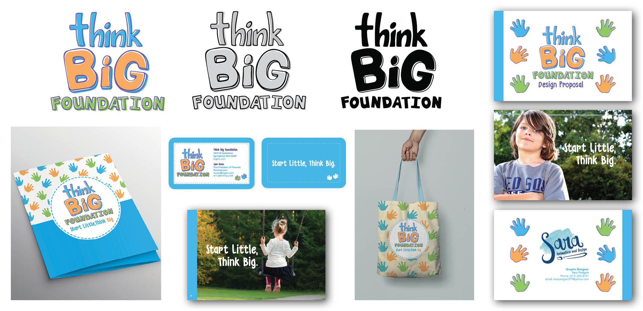
(Think Big Foundation 5/8/2020)
The purpose of this project was to create a new brand identity for the Think Big Foundation, a new local non-profit that serves the ozarks by providing children with quality, gently used clothing. This included creating an orignal logo, folder, business cards, packaging, and a style guide (a sample of which has been included).
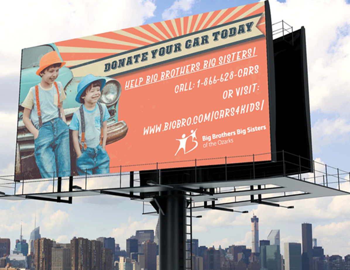
(Tyler Moles, Vice President of Big Brothers Big Sisters of the Ozarks 4/1/2018)
For this project, the client, the nonprofit organization Big Brothers Big Sisters of the Ozark, needed a billboard design that would promote their car donation program. In order to achieve this, I drew inspiration from one trait that both kids and cars have in common: energy, and utilized line angles and the colors yellow and orange, which are often associated with energy.
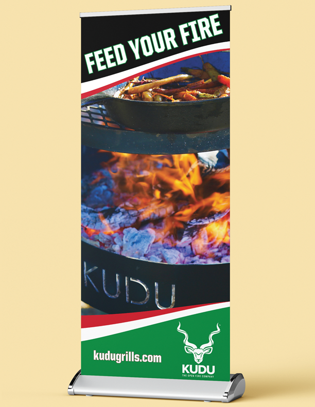
(Westward Alliance 5/8/2024)
This is a standing banner that was created for the launch of Kudu Grill's. The idea was to emphasize the fluid motion of fire, to give an exciting and adventurous feeling, just like the outdoor's.
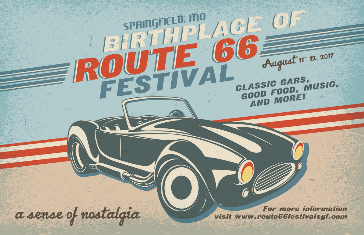
(Springfield Chamber of Commerce 8/1/2017)
This is a formerly proposed billboard design for the Route 66 Festival, in Springfield, MO. Making use of the nostalgic atmosphere of Route 66, I designed a billboard based on auto shop ad's from the 1950's.
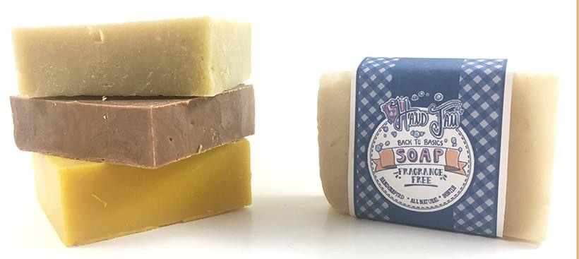
(Hand Jam Soap 6/8/2023)
For this project, I designed the logo and packaging for a small soap making business, called Hand Jam The business needed a new logo, and packaging for their bar soaps.
The soaps contain no preservatives. The owner also really wanted to emphasize the fact that their products are made with fresh foods to give customers a gentle, but effective and safe cleansing.
Using this as inspiration, I designed a label a logo with a fresh, bright, and simple look.
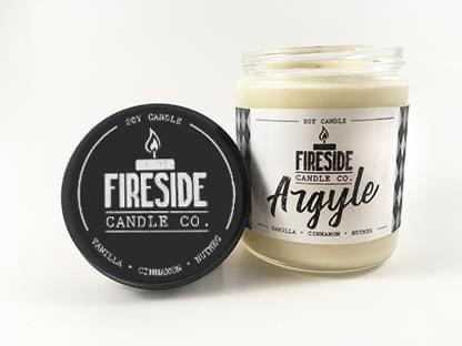
(Fireside Candle Company 7/21/2023)
In this project, the company was a new candle maker, and they didn’t really know where they wanted to go with their product and logo designs visually All of their candles are very musky, woodsy scents.
Knowing this, I decided to build off their scent profiles and design logos, product labels, color palettes, and typography all based around the feeling of a cool winter night in a cabin in the woods.
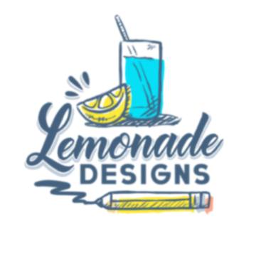
(Lemonade Designs 5/5/2023)
The logo design for myself. The goal was to create a logo that was inspired by morning breakfast diners, like Denny's or Perkins, to show that our business will leave you with a happy, positive experience that will leave your brand looking fresh and new.
After hours of research on current design trends in typography, I worked to design two separate font styles: A relaxed and flowy cursive font for "Lemonade", with a heavy-weighted font that gave a stable feeling for the word "Designs".
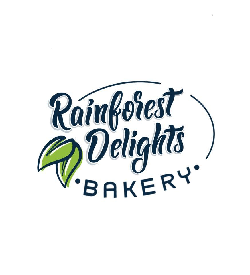
(Rainforest Delights 5/8/2024)
This is the logo I designed for the upcoming small baked goods food truck, “Rainforest Delights Bakery”. Their goal is to bring education and awareness of the wildlife in the Rainforest through their baked goods, using ethically sourced ingredients found in the Rainforest.
I wanted to create a logo that matched the flowy nature of "rain", along with a second font that had a lot of contrast to draw more attention to the "Rainforest Delights" portion of the logo. The leaves also help to create a small pop of color, using the color most commonly associated with the rainforest, green.
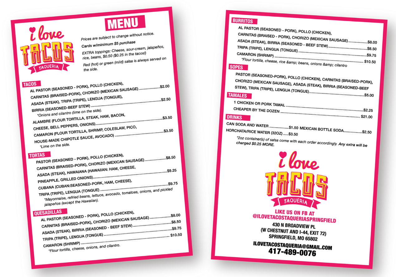
(I Love Tacos Taqueria 7/1/2021)
This is a large wall menu, and a small FB post menu, for local food truck I Love Tacos Taqueria.
I designed the layout, with an emphasis on the typography. With this much content, I wanted the readability of the menus to be the top priority. The bright pop of hot pink also helps to separate each catagory.
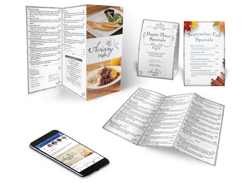
(Aviary/Westward Alliance 6/3/2018)
I had the chance to design takeout menus, table menus, and a web ad for Aviary Restaurant. With photo editing, typesetting, and great layout design, these really give off a nice upscale look to this amazing local restaurant.