Weekly Drop Media Newsletter
Mediabistro Weekly Drop: The Out of Office Edition
You may have noticed the Weekly Drop hasn’t dropped in two weeks. Or you didn’t, because you were also gone, in which case, welcome back, […]
Hot Jobs
Mission-Driven Media Jobs Hiring Now in 2026
Purpose-Led Organizations Are Building Out Their Media Teams Something worth watching is happening in the mid-2026 job market: organizations with a sharp editorial mission are […]
Hot Jobs
Podcast, Food, and Tech Writing Jobs Hiring Now in Media
Audio, Food Media, and Tech Writing Are All Hiring at Once Three very different corners of media are posting senior-level roles right now, and together […]
Hot Jobs
Independent Media Is Hiring Editors and Reporters Right Now
Small Newsrooms Are Investing Where Big Ones Won’t The most telling signal in today’s job market has nothing to do with layoffs. It’s what independent […]
Hot Jobs
Digital Strategy Jobs Hiring Now in Music, Media, and Politics
Platform Strategy Is the Skill Set Everyone Wants Right Now Three of today’s most compelling media job listings share a common thread: they all need […]
Hot Jobs
Conservation, Public Media, and Storytelling Jobs Hiring Now
Mission-Driven Media Is Quietly Building Its Bench Something worth watching is unfolding in today’s media job listings: organizations with a purpose beyond profit are competing […]
Hot Jobs
Media Operations and Strategy Roles Are Hiring Across Studios, Parks, and Search
The Operator-Creative Hybrid Is the Role of the Moment Something worth paying attention to across today’s listings: the most interesting roles don’t fit neatly into […]
Hot Jobs
Editorial and Content Jobs Hiring Now Across Film, Tech, and Government
Specialist Editors Are Back in Demand For years, the industry talked about generalists. Every job description wanted someone who could write, edit, shoot video, manage […]
Hot Jobs
Niche Media and Policy Newsrooms Are Hiring Reporters and Strategists
Mission-Driven Media Is Building Out Its Newsrooms Scroll through today’s featured media job listings and a clear pattern emerges: organizations with specific editorial missions are […]
Stories, ideas, and perspectives to spark your next creative move. Be Inspired features profiles, essays, and thought pieces that celebrate the work of media and creative professionals and remind you why you got into the industry in the first place.
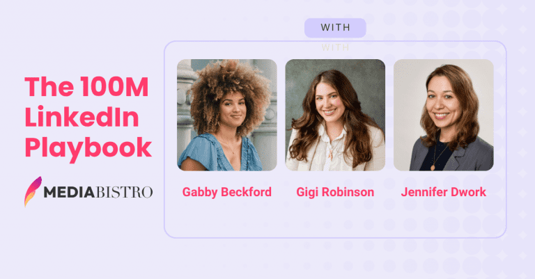
One Creator With 34,000 Followers Generated 100 Million LinkedIn Impressions Last Year. Most Media Companies Can’t Come Close.
A creator with 34,000 LinkedIn followers generated over 100 million impressions in 2025. The average media company page, backed by a full newsroom, didn’t come […]
How to Transition From Editorial to a Social Media Career
Long gone are the days when social media was used purely for entertainment purposes. Sure, there are folks who still love nothing more than to […]
7 Surprising Things You Didn’t Know About Unions in Media
If you work within the media world, odds are you’ve heard of a union. Recently, digital and print publishing companies such as Harper Collins and […]
5 Signs It’s Time to Start Looking for a Different Job
The fact that you’re reading this probably means you’re at least considering whether it’s time to leave your job or stick with a job that’s […]
SEO Specialist, Expert, and Consultant: What These Positions Do and How to Get Hired
An SEO Specialist (also called an SEO Expert, SEO Strategist, or Search Engine Optimization Specialist) is responsible for improving a website’s visibility and ranking in […]
5 Bad Writing Habits That Hurt Your Career (And How to Fix Them)
In this article: Neglecting to Read | Jumping In Without an Outline | Editing While You Write | No Writing Routine | Reacting Poorly to […]
Adam Glassman Interview: What It’s Like Being Creative Director at O, The Oprah Magazine
Interview originally conducted during Adam Glassman’s tenure as Creative Director at O, The Oprah Magazine In this article: Quick Facts | The Creative Director Role […]
Resources and guidance for job seekers in media, marketing, and creative industries. From crafting your personal brand to navigating the hiring process, Candidates gives you the tools and insights to position yourself as the standout choice.
How to Withdraw a Job Application: Email Templates & Examples for Every Situation
In this article: Reasons to Withdraw Application | When to Withdraw | How to Withdraw | Ready to Use Email Templates for Withdrawing from Job […]
How to Write a Thank-You Email After an Interview (With Copy-Paste Templates)
So, you had a job interview. Great! Before you sit back and begin the waiting game, we’re here to tell you that your work is […]
How to Reschedule a Job Interview Professionally (With Email Templates)
In this article: Stay Calm | Reschedule Quickly | Call First | Give a Reason | Apologize | Suggest Dates | Follow Up | Email […]
5 Skills You Need to Work at a Startup
If you’re a professional seeking a new job, there’s a good chance you’ve considered working for a startup. According to the U.S. Census Bureau’s Business […]
How to Send References in an Email: Templates & Examples for Every Step
In this article: When to Provide References | Who to Ask | How to Ask | How to Send References | Reference List Format | […]
Thank You Email After a Bad Interview: How to Recover (With Templates)
Even if your interview didn’t go exactly the way you hoped, it’s still possible to leave a positive final impression before the hiring manager makes […]
How to Choose Job References (Yes, You Can Use Coworkers)
In this article: Why References Matter | Can You Use a Coworker? | Who to Ask | How to Prep Your References | Include Variety […]
News and developments at the intersection of media careers and education. From journalism school updates and industry training programs to workforce trends and skills in demand, Careers & Education keeps you informed on what's shaping the next generation of media professionals.
Will My Job Still Exist in 10 Years?
Jobs that might not exist in 50 years On the surface, unemployment figures in the United States may paint a picture of resilience. In June 2025, […]
Why The Mediabistro Weekly Drop Is the Must-Read Media Careers Newsletter
If you work in media, journalism, entertainment, publishing, or digital content and feel like the rules keep changing, you are not imagining it. Attention is […]
5 Best AI & Tech Courses for Writers to Future-Proof Their Career (2026)
The creative landscape is shifting under our feet. For journalists, copywriters, editors, and content strategists, the headlines about Artificial Intelligence can be anxiety-inducing. And it […]
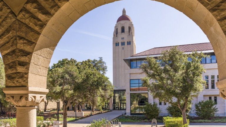
Best private colleges in America
Best private colleges in America Heading off to college comes with a hefty price tag. At ranked public schools, 2025-2026 tuition costs rose 3.3% on […]
States with the highest SAT scores
smolaw // Shutterstock States with the highest SAT scores The source of dread for nearly 2 million high schoolers every year, the SAT, or Scholastic […]
Best big college towns in America
Roberto Galan // Shutterstock Best big college towns in America Every year, students from across the country agonize about where to go to college. The […]
‘Failing our kids’: Philadelphia’s struggle highlights how young learners nationwide miss out on legally mandated support services
Rebecca Redelmeier // Chalkbeat ‘Failing our kids’: Philadelphia’s struggle highlights how young learners nationwide miss out on legally mandated support services When Kimberly Halevy’s son […]
Practical strategies for advancing your media or creative career. Climb the Ladder delivers tips on getting promoted, negotiating raises, building your professional network, and making smart moves that take you to the next level.
What Does a Copywriter Do? Responsibilities, Skills & Career Guide
A copywriter creates clear, compelling copy to sell products and/or educate and engage consumers.
How to Network Like a Boss
Sometimes when you say the word “networking“, you can actually see people shudder. There aren’t many terms that bring up such acute feelings of dread […]
Are Cover Letters Still Necessary? What Hiring Managers Really Think
A lot is changing about how we work and how we apply for work in 2026. Remote work is becoming more popular, Applicant Tracking Systems […]
How to Follow Up After a Job Interview (With Example Emails)
We get it. Applying for a job is no easy task. It can take hours to find a job that looks like a good fit, […]
Marketing Professional Associations: The Best Organizations to Join
Joining a professional organization opens up possibilities to build your network, take advantage of learning opportunities and become involved in ways that add cred to […]
What Does an Account Manager Do? Skills, Salary & How to Break In
In this article: What Account Managers Do | Key Responsibilities | Required Skills | Salary | Career Path | How to Break In | FAQs […]
What Does an Event Planner Do? Responsibilities, Skills, Salary & Career Path
In this article: What They Do | Responsibilities | Skills | Types of Events | Salary | Career Path | How to Break In | […]
News and insights from the entertainment industry. From film and television to streaming, music, and gaming, our entertainment coverage tracks the deals, talent moves, and business developments that matter to media and creative professionals.
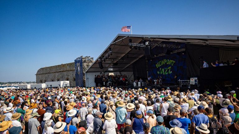
July 2026 music festivals ranked by lineup value
Miquel Llop // NurPhoto via Getty Images July 2026 music festivals ranked by lineup value Summer festival calendars are crowded, and ticket prices can vary […]
HBO’s ‘Euphoria’ reveals what most people get wrong about addiction and grief, according to a psychologist
Eddy Chen // HBO HBO’s ‘Euphoria’ reveals what most people get wrong about addiction and grief, according to a psychologist HBO’s “Euphoria” ended with a […]
25 actors who were fired or quit hit TV shows in their first seasons
Noel Vasquez // Getty Images TV actors who were recast within the first season Can you imagine your favorite TV show without your favorite actor […]
What data shows about choosing the right summer music festival
Douglas Mason // Getty Images What data shows about choosing the right summer music festival Summer music festival season gives fans, artists, and industry teams […]
How many of the worst romantic comedies ever made have you suffered through?
Mondadori via Getty Images 100 worst romantic comedies of all time William Shakespeare laid the groundwork for romantic comedies way back in 1598, when he […]
The worst movie from every major film franchise, according to audience ratings
United Artists // Getty Images Worst movie from 50 famous franchises Experts agree that the first feature-length film the world saw was “The Story of […]
Everything you need to land your next media or creative role. Get Hired covers resume writing, interview prep, portfolio tips, job search strategies, and insider advice to help you stand out and get the offer.
4 Essential Steps to Repair Your Online Reputation
Here’s a hard truth: You’ve been Googled. It’s a paradox of sorts, this notion that we want to be recognizable and known, but that we only […]
How to Find a Job Before It’s Posted
You know the drill: A job posts on the Internet; you respond and keep your fingers crossed for an interview. Whether you are looking for […]
TV News Jobs: A Field Guide to Every Role in the Newsroom
TV news is one of those industries that outsiders assume is shrinking, and insiders know is just shifting. Local affiliates, cable networks, streaming news channels, […]
Write a Cover Letter for a Job You Want Without Sounding Desperate
You found a job for which you absolutely must apply. Whether it’s the role you’ve always wanted or the one you need to keep the […]
Should You Hire a Professional Resume Writer? Here’s How to Decide
Whether you’re already employed, searching for work or looking to assess your skills, enlisting the help of a professional is always a smart move.
Reasons You Need a Professional Resume Writer
Here’s how a professional resume writer brings industry knowledge to give you that much needed interview-landing edge.
Why You Need an Updated Resume — Even When You’re Not Job Hunting
Here are just a few reasons why you should always keep your resume current—even if you’re not looking for a job.
Your guide to building a successful freelance career in media and creative industries. Go Freelance covers finding clients, setting rates, managing your business, and navigating the unique challenges of working for yourself.
6 Ways to Track Down a Magazine Editor’s Email for Your Pitch
Creating a winning magazine article idea and then articulating it into a knockout query letter is challenging enough for most writers, but all that hard […]
Five Signals It’s Time to Leave Freelancing (Even If You Don’t Want To)
Nobody throws you a going-away party when you leave freelancing. The launch gets celebrated. The first client win, the byline, is the day you go […]
Bookkeeping 101: A Freelancer’s Guide to Better Business Finances
So you’re a super-talented writer able to weave concepts into compelling narratives, interviews into stories of interest, and ideas into novels. But how are your […]
Freelance Writing Jobs: Where to Find Work & How to Get Started in 2026
In this article: Types of Freelance Writing | Where to Find Jobs | Freelance Writer Rates | Skills Required | Getting Started | Tools | […]
How to Get Your First Magazine Feature Story Accepted
Tired of writing for the FOB? Veteran freelancers give their tips on how you can move up to feature bylines.
Hed, Dek, Lede & More: 10 Journalism Terms Every Freelance Writer Should Know
In this article: Hed, Dek & Lede | Slug | FOB & BOB | The Well | Slush Pile | On Spec | Over the […]
6 Reasons a Journalism Degree Is Still Necessary
Anyone with the passion to write can start a WordPress or Substack and call themselves a journalist, but there’s more to a career in journalism […]
Conversations with the people shaping media and creative industries. Our interviews feature editors, executives, creators, and professionals sharing their career paths, insights on the industry, and advice for those looking to follow in their footsteps.
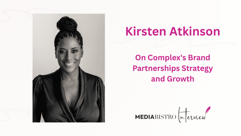
How Complex’s SVP of Brand Partnerships Turned Cultural Moments Into Commerce
Kirsten Atkinson has spent more than 25 years in media, advertising, and marketing, but her title at Complex barely hints at the scope of what […]
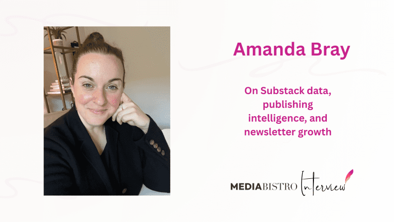
Amanda Bray Wants Substack Creators to Stop Flying Blind
Amanda Bray’s career reads a little like a map of everything the media industry has been through in the last two decades. She started at […]
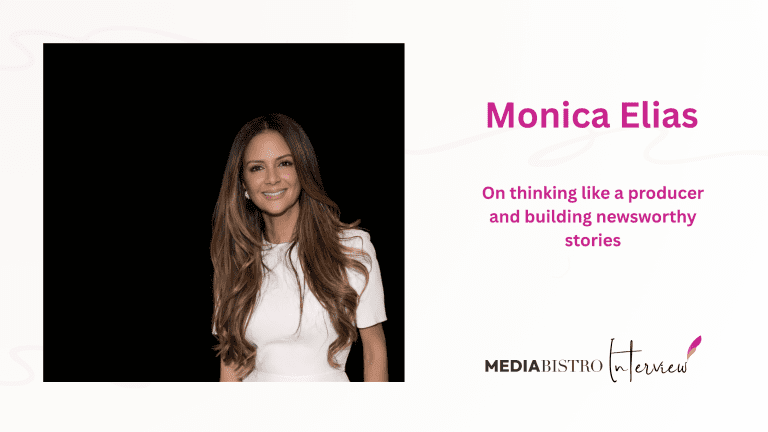
Monica Elias Has Spent Nearly 30 Years Thinking Like a Producer. Here’s What She Learned.
Monica Elias has spent nearly three decades operating in that space where broadcast journalism and brand strategy collide. It’s where a lot of the employment […]
So What Do You Do, Frank Warren, Founder, PostSecret Project?
With more than 200 million visitors over the past ten years, PostSecret’s success is the stuff of Internet marketing dreams. And yet, founder Frank Warren has remained […]
So What Do You Do, Isaac Mizrahi, Fashion Icon and Creative Director?
The prolific designer dishes on the 'irresistible drama' of hosting a reality show, and getting personal on his video blog.
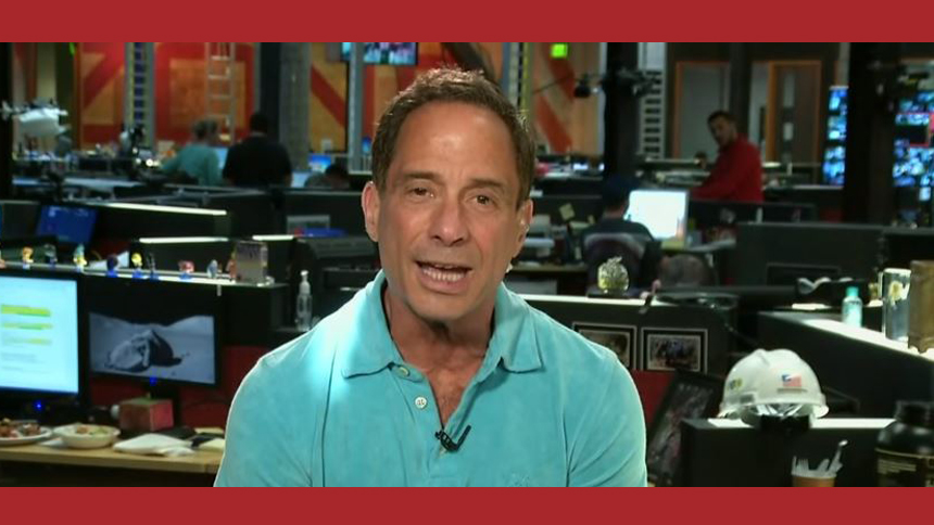
Harvey Levin: Founder and TMZ Host. Interview with the Celebrity News Pioneer
Interview originally conducted in 2009 In this article: Quick Facts | Career Overview | Full Interview | FAQs Harvey Levin is the founder, executive producer, […]
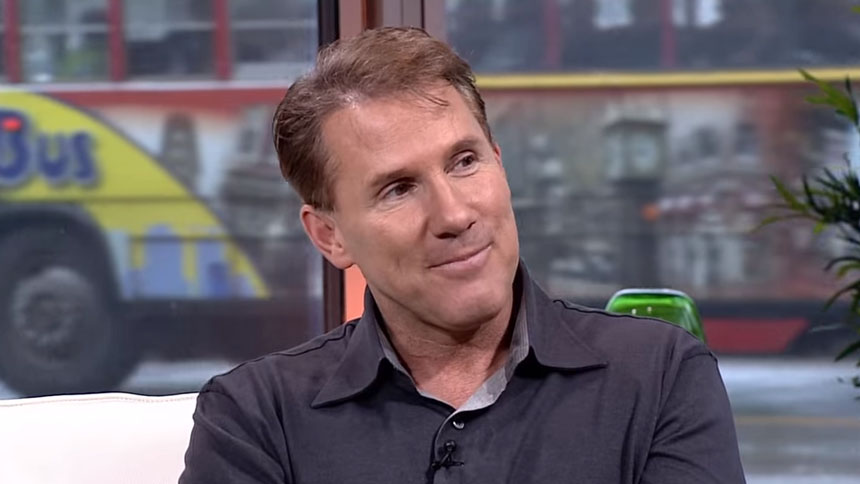
So What Do You Do, Nicholas Sparks, Bestselling Romance Novelist?
He’s been called the “King of Romance” but he rejects the title. People deemed him the “Sexiest Author Alive,” yet he’s a happily married father […]
Explore the latest from Los Angeles, the epicenter of entertainment and media. From Hollywood studio deals and streaming wars to agency moves and shifts in the creative job market, our LA coverage keeps media and entertainment professionals informed about the stories shaping the industry.
Highest-earning counties in California
Marek Masik // Shutterstock Highest-earning counties in California Data shows that annual annual income depends heavily on an individual’s educational attainment, race, ethnicity, gender, and […]
Best draft picks in Sacramento Kings history
Merge Digital Media LLC // Shutterstock Best draft picks in Sacramento Kings history The draft is a seminal moment for many incoming players. Putting aside […]
Best draft picks in Los Angeles Lakers history
Joseph Sohm // Shutterstock Best draft picks in Los Angeles Lakers history The draft is a seminal moment for many incoming players. Putting aside competitive […]
Best draft picks in Golden State Warriors history
Rich Lonardo // Shutterstock Best draft picks in Golden State Warriors history The draft is a seminal moment for many incoming players. Putting aside competitive […]
So What Do You Do, Ted Genoways, Editor, Virginia Quarterly Review?
Archive Interview: This interview was originally published by Mediabistro in approximately 2007. It is republished here as part of the Mediabistro archive. Leading up to […]
Sia Michel on Her First Year Running Spin and What Comes Next
Archive Interview: This interview was originally published by Mediabistro in the early 2000s. It is republished here as part of the Mediabistro archive. In February […]
Joyce Rutter Kaye on Print Magazine’s Third Ellie Nod and Losing Designers to the Web
Archive Interview: This interview was originally published by Mediabistro in the mid-2000s. It is republished here as part of the Mediabistro archive. Leading up to […]
Heather Cocks and Jessica Morgan on Parlaying a Fashion-Snark Blog Into a Book Deal
Archive Interview: This interview was originally published by Mediabistro in the mid-2000s. It is republished here as part of the Mediabistro archive. The madness this […]
Eileen Gittins on Disrupting Traditional Publishing and Crafting a Viable Business in Self-Publishing
Archive Interview: This interview was originally published by Mediabistro around 2010. It is republished here as part of the Mediabistro archive. As publishing houses struggle […]
J-School Confidential: How One College Junior Charted His Own Path Without Journalism School
Archive: This article was originally published by Mediabistro around 2011. It is republished here as part of the Mediabistro archive. Welcome to our new series, […]
Do Campus Papers Still Matter? A Journalism Student Takes Stock
Archive: This article was originally published by Mediabistro around 2011. It is republished here as part of the Mediabistro archive. Welcome to our new series, […]
Media and creative industry news from the heart of New York City. From publishing and advertising to digital media and beyond, our NYC coverage tracks the deals, moves, and trends shaping one of the world's most influential media markets.
Highest-earning counties in New York
Wangkun Jia // Shutterstock Highest-earning counties in New York Data shows that annual annual income depends heavily on an individual’s educational attainment, race, ethnicity, gender, […]
Sweet corn, stone fruit and strong opinions: What Instacart orders reveal about New York's summer produce season
beton studio // Shutterstock Sweet corn, stone fruit and strong opinions: What Instacart orders reveal about New York’s summer produce season Ask anyone what summer […]
Best draft picks in New York Knicks history
littlenySTOCK // Shutterstock Best draft picks in New York Knicks history The draft is a seminal moment for many incoming players. Putting aside competitive stakes, […]
Best draft picks in Brooklyn Nets history
T photography // Shutterstock Best draft picks in Brooklyn Nets history The draft is a seminal moment for many incoming players. Putting aside competitive stakes, […]