Dawn Camner

New York, NY USA
Website: http://dawn@dawncamner.com
Contact

Professional Experience

Magazines, books, newsletters, collateral, brand identity, and most everything print. I'm an award-winning art director and designer with a background in fine art. I can do it all from concept, branding and layout design to retouching, color, and production. I'm known for coming up with creative ways to make work affordable but beautiful.

Expertise

Art Director
10 Years
Designer
12 Years

Specialty

Entertainment
5 Years
Family, Children & Teenagers
5 Years
Lifestyle
8 Years

Industries


Advertising, client side
8 Years
Book Publishing Consumer
5 Years
Magazine - Large Consumer/National magazines
9 Years

Total Media Industry Experience

10 Years

Media Client List (# assignments last 2 yrs)

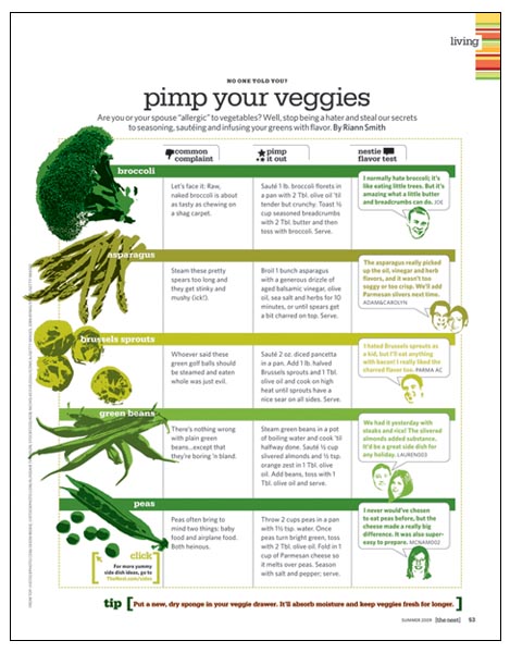
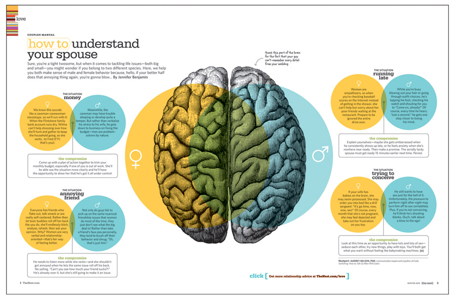
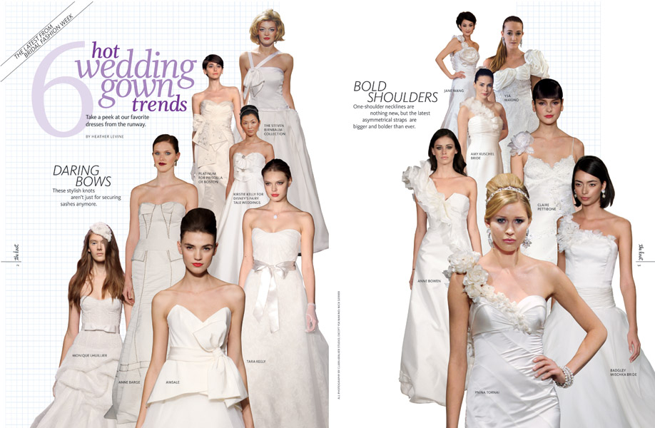
The Bump magazine (1-2), Mondo publishing (1-2), Earth to You magazine (1-2), New York Post (6-10), Westport magazine (3-5), HarperCollins Kids (10+), People magazine (10+), Jacob Packaged Goods (10+), The Knot magazine (10+), The Nest magazine (10+), Us Weekly magazine (10+)

Corporate Client List (# assignments last 2 yrs)

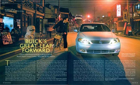
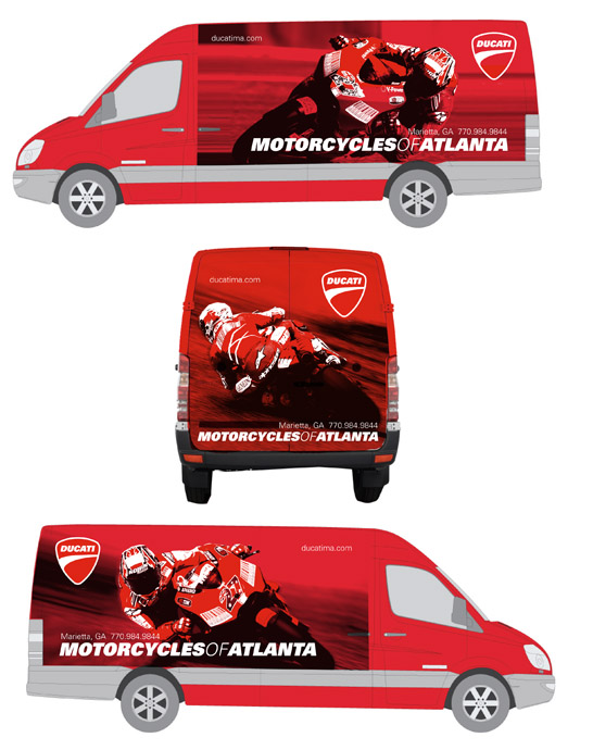
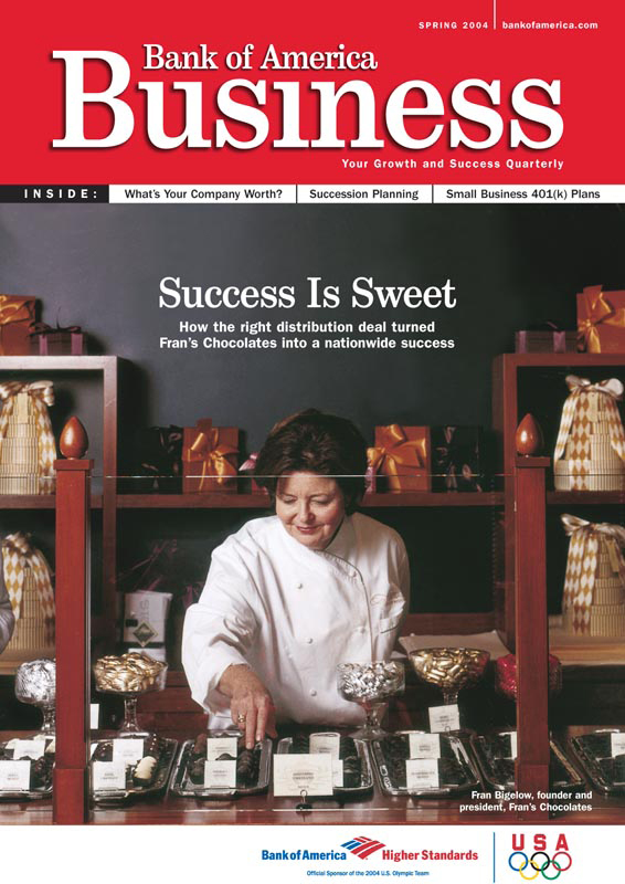
Buick (3-5), Ducati (3-5), Bank of America (1-2)

Other Work History

Us Weekly magazine-Associate Art Director The Publishing Agency-Art Director/Senior Designer Sports Illustrated for Kids-Designer Jacob Packaged Goods-Designer/Illustrator

Technical Skills

High end photo retouching, rendering and color correction

Unions

Freelancer's Union

Computer Skills

Quark, InDesign, Illustrator, Photoshop, QPS, K4, MediaGrid, Merlin, PowerPoint, Word

References

On request

Awards

Society of Publication Designers 2006 for The Nest magazine, Folio magazine Ozzie Award 2009 The Bump magazine

Associations

mediabistro.com Avant Guild member

Showcase

Magazine / editorial

I found that after doing some photo research, Shanghai has almost as much bicycle traffic as they do cars. Buick allowed us to commission a photo shoot on the streets of Shanghai, showing a bicyclist ogling a passing luxury Buick for this story about Buick's presence as a luxury brand in China.
Scoop is a 5 page section of People that gets designed in 3 to 4 hours each Monday by yours truly (once in a while with some help on one page). It's a challenge to say the least, but over the past few weeks I've tried to develop a set style that makes it easy to design, but also fun and dynamic and as refined as possible considering the time constraints. My leanings in this case are to use silhouettes, bright colors, graphic elements and nice type combinations.
The challenge here was little to no budget for art and limited photo resources. By silhouetting photos and making them black and white, and by carefully choosing manipulatable vector illustrations from a stock art website, I created consistency. I also came up with the visual theme of the color coordinated keys to keep the reader inside the theme of a section. The attached PDF is only half of the book.
Summer music tours package.
I 'pimped' some boring veggie photos by giving them a screen printed look, and designed this chart to look fun but clean and easy to read.
Using Venn Diagrams over a brain to illustrate the male and female meeting of the minds.
Showing what's hot on the bridal runway using elegant shapes and typography.
Sometimes a limited budget limits the quality of available art to design with. In this case, I used seperate pieces of affordable stock illustration. I manipulated and arranged the objects, and mixed with typography to make lemonade, so to speak.
Instead of arranging a bunch of random products across the spread, I found and manipulated a pretty, modern looking background that was in keeping with The Bump brand look, and at the same time anchoring the floating objects.
I came up with the concept and assigned the brilliant Chris Rubino to illustrate an otherwise dry (but informative!) subject.
Cover story for The Nest magazine. This was written as bits and pieces of advice on how to survive the in laws during the holidays. I designed it so that each piece reads as separate advice, while interacting, overlapping and still looking cohesive.
The art for this road test story was shot by the editor herself with a regular point and shoot digital camera. In keeping with the edgier look of The Nest magazine, I blew out and saturated the image turning an otherwise unusable photo into a vibrant full bleed image.
People magazine cover story on the Chelsea Clinton wedding.
Feature story on Tori Spelling.

Catalog

I conceptualized, designed, art directed the photo shoot and created background digital illustrations using old etchings of russian and caviar related imagery for this 8 page catalog.

Corporate Identity / Collateral

I gave this retail sprinter wrap the characteristic sexy Ducati look using photoshop manipulated images of Ducati's World Champion racer Casey Stoner. Each side of the sprinter shows a different image of Stoner at relatively the same lean angle, so that as you pass the sprinter on the road, you can see different views of the same maneuver.
Different lockup designs for different usages created for my brother's software company.
3-D exterior signage for Sid's bike shop in NYC.
Interior signage and design consulting.
Postcard for Sid's event retaining designed identity.
I designed this logo for a bicycle retailer with 2 locations in Manhattan. The website, showrooms and all collateral were designed based on the colors and the sporty, modern, energetic feel of the logo.
Postcard for Sid's event retaining designed identity.
Different usage options of a logo I designed for a business consulting company.
I designed two logos for a California motorcycle dealership who wanted to lean the feel of their identity toward their italian racing heritage motorcycles. I designed a very european looking logo for Cafe Veloce, their coffee shop with the dealership, and a retro logo using race flags for their business logo.

Children's books

Spread for the book "Step Into Narnia: A Journey Through The Lion, The Witch, and The Wardrobe". Disney provided images of character prototypes used for the motion picture "Narnia". It was then up to me to create backgrounds and typography unique to each spread.
Spread for the book "Step Into Narnia: A Journey Through The Lion, The Witch, and The Wardrobe"
A spread from a book based on Disney's Narnia motion picture.
Part of the pitch that won the business for a series of Smithsonian content books for kids. The concept was to present a Smithsonian museum in a book. As though you were at the museum looking under or behind the display glass.

Newsletter

Cover of Bank of America business newsletter for small business owners.
Cover for Forum newsletter for an advertising subdivision of McCann-Erickson.